Phyco Health: Eco-Conscious & Healthy Kids' Snacks Packaging
Packaging & Sub Brand Aesthetic
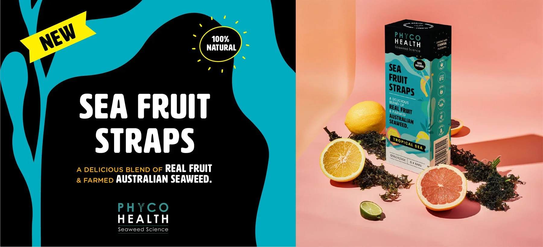
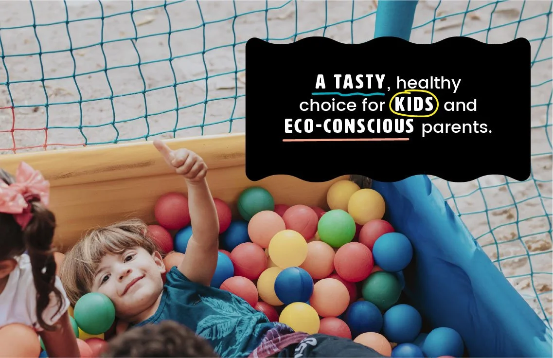
Phyco Health needed a sub brand visual language and packaging for their new product, sea straps, targeting eco-conscious parents while maintaining their appeal to adults. They sought a design that seamlessly integrated with their existing brand while introducing vibrant pop colors and playful illustrations to attract children.
Requirement
Response
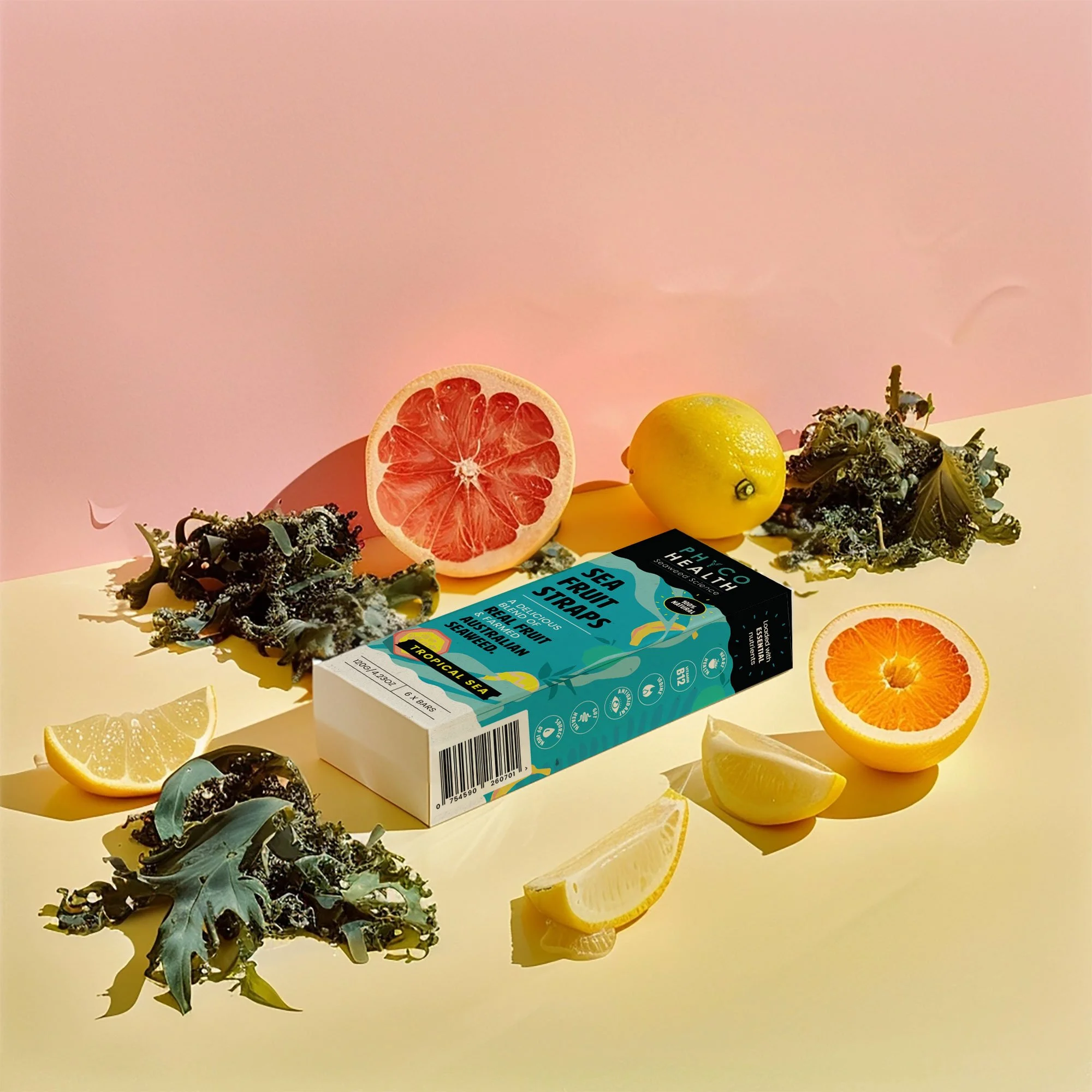
We embarked on a creative journey, crafting a visual identity that bridged Phyco's adult-oriented branding with the eco-consciousness needed to engage parents and appeal to children. Through careful consideration of typography, illustrations, and color palette, we created a cohesive and eye-catching design that captured the essence of the sea and the product's nutritional benefits.
Outcome
The resulting packaging and visual language not only resonated with Phyco's target audience but also stood out on the shelves, drawing attention to the product's unique blend of real fruit and ocean nutrition. By seamlessly blending elements of sophistication with playful charm, we helped Phyco establish a distinct sub brand that appealed to both adults and children, ultimately driving sales and brand recognition.
Sea fruit straps combine real fruit goodness with ocean nutrition, including marine protein, vitamin B12, iron, and iodine. Produced on the pristine South Coast of NSW, we aim for a sustainable future from the sea.
Say Hello!
Looking for a freelance graphic designer to collaborate with? I’d love to hear from you.
Other Work
