Manbulloo Mango Farm Production Branding
Logo Design, Visual Language & Packaging
Requirement
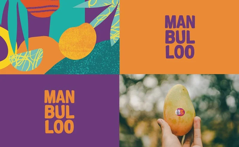
Manbulloo, a prominent mango supplier to leading Australian supermarkets like Coles, sought a rebrand after a decade of operation. Their goal was to modernize their image, remain relevant, and broaden their product range. The challenge lay in creating a design reflecting the theme 'fruitful adventures' that could stand out on small fruit stickers while maintaining versatility and impact.
Response
Our approach centered on infusing the essence of the tropics into the brand identity. We crafted a vibrant, tropical-inspired pattern and simplified fruit forms to achieve a contemporary, clean design. The key innovation was the dynamic stacking nature of the logo, which maximized visibility on small stickers, ensuring a striking presence despite the limited space. Our comprehensive design overhaul included branding, logo design, illustration, packaging, and both print and digital assets.
Outcome
The rebranding initiative catapulted Manbulloo into a fresh era of market relevance and expansion. The newly designed packaging and logo not only captivated consumers but also communicated the brand's commitment to quality and adventure. By enhancing visibility on the shelves through impactful sticker designs and versatile branding elements, Manbulloo experienced a significant increase in consumer engagement, solidifying its position as a leading provider in the competitive fruit industry.
Completed with brand strategy agency Truly Deeply
Say Hello!
Looking for a freelance graphic designer to collaborate with? I’d love to hear from you.
Other Work
Make it stand out.


